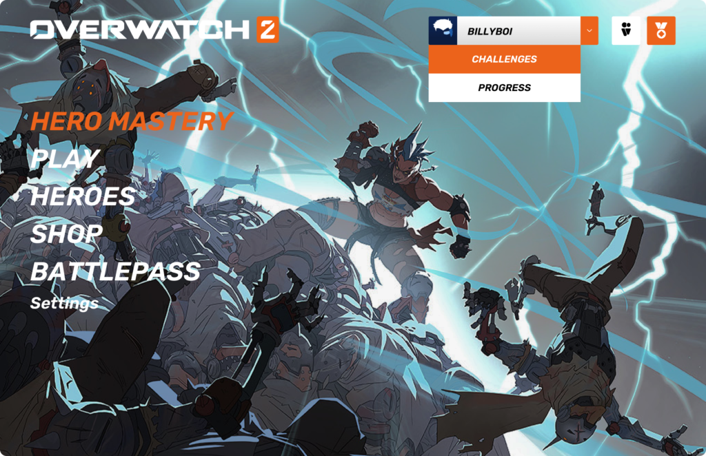
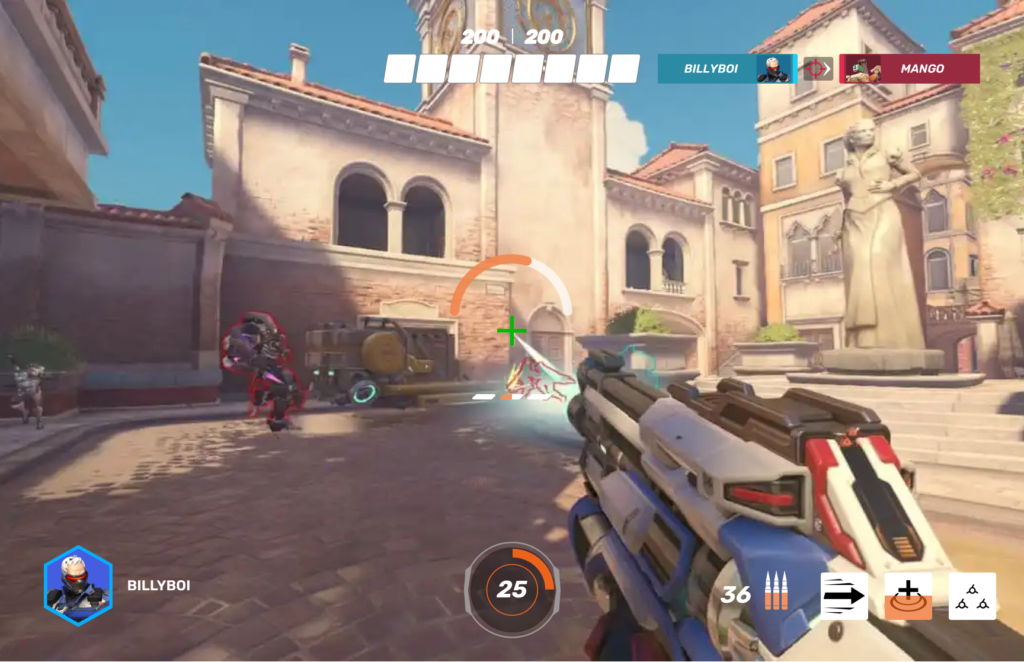
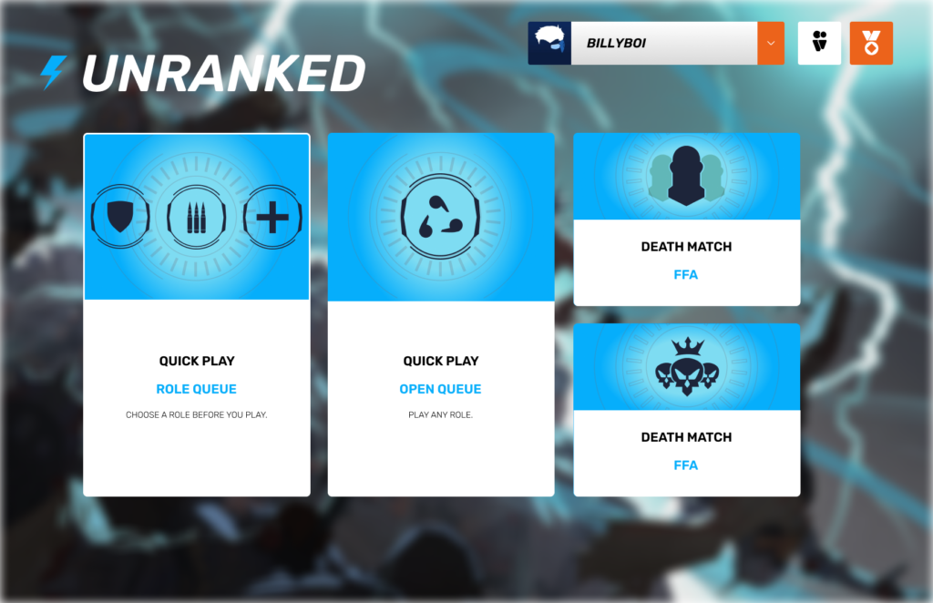
Overwatch 2 UI Redesign
Graphic Design, UX & UI Design
WHAT IS THE EXPERIENCE?
Interviewed active residents and compiled data about their pain points and needed improvements
REASEARCH AND OUTLINE
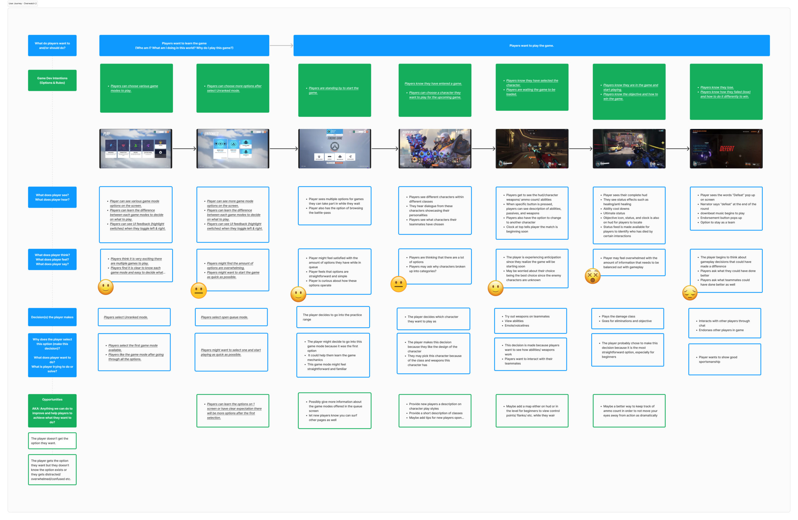
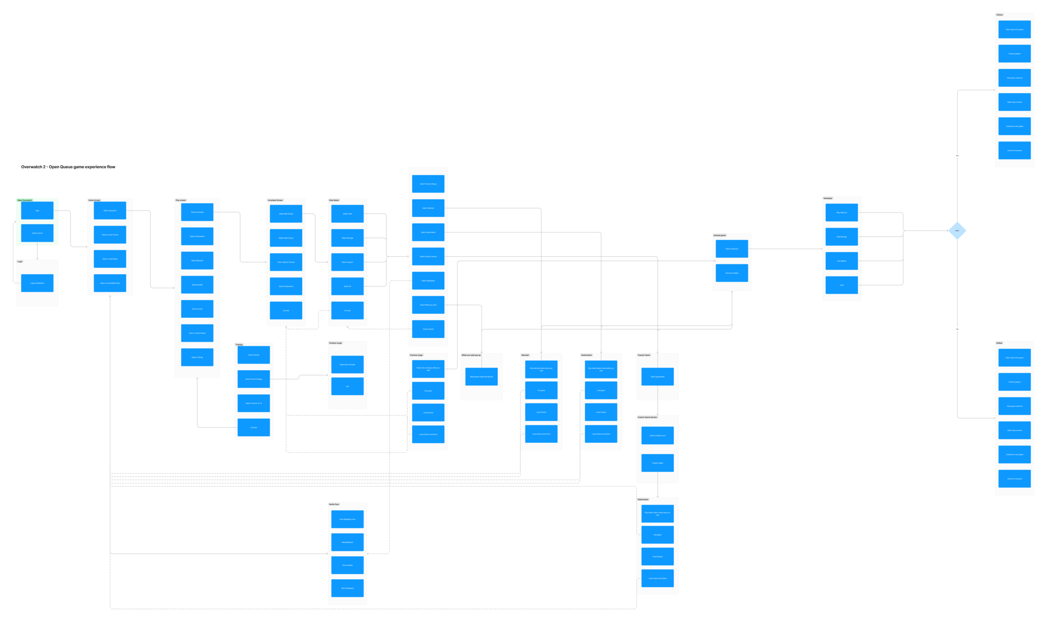
After observing how new and veteran players make their choices when entering their first game of the day, I was able to create a structured outline of their actions. This would help me find holes in the current flow that could be improved or reworked.

FLOW CHART
LOW FIDELITY WIREFRAMES

USABILITY TESTING
Through usability testing and interviews I was able to further identify player goals and frustrations with the current Overwatch 2 gameplay options.
Information architecture was enhanced in order to make important tasks more prominent.
Call to actions were improved for residents to be able to navigate the portal easily and complete tasks more efficiently.
Recent activities section was added in order to improve communication by presenting clear status updates through recent events so that residents are always up to date.
FINAL DESIGNS
The final UI screens were put through a color blindness test in order to reveal if there were any issues with contrast or colors that would make gameplay difficult.
