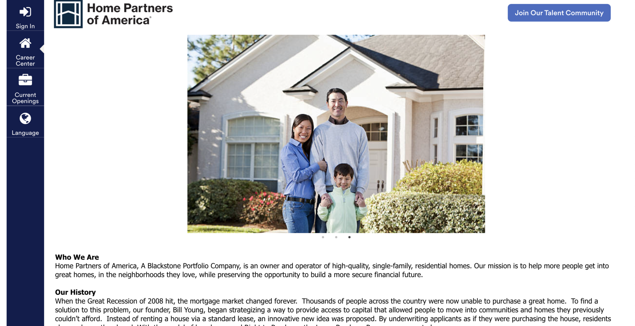
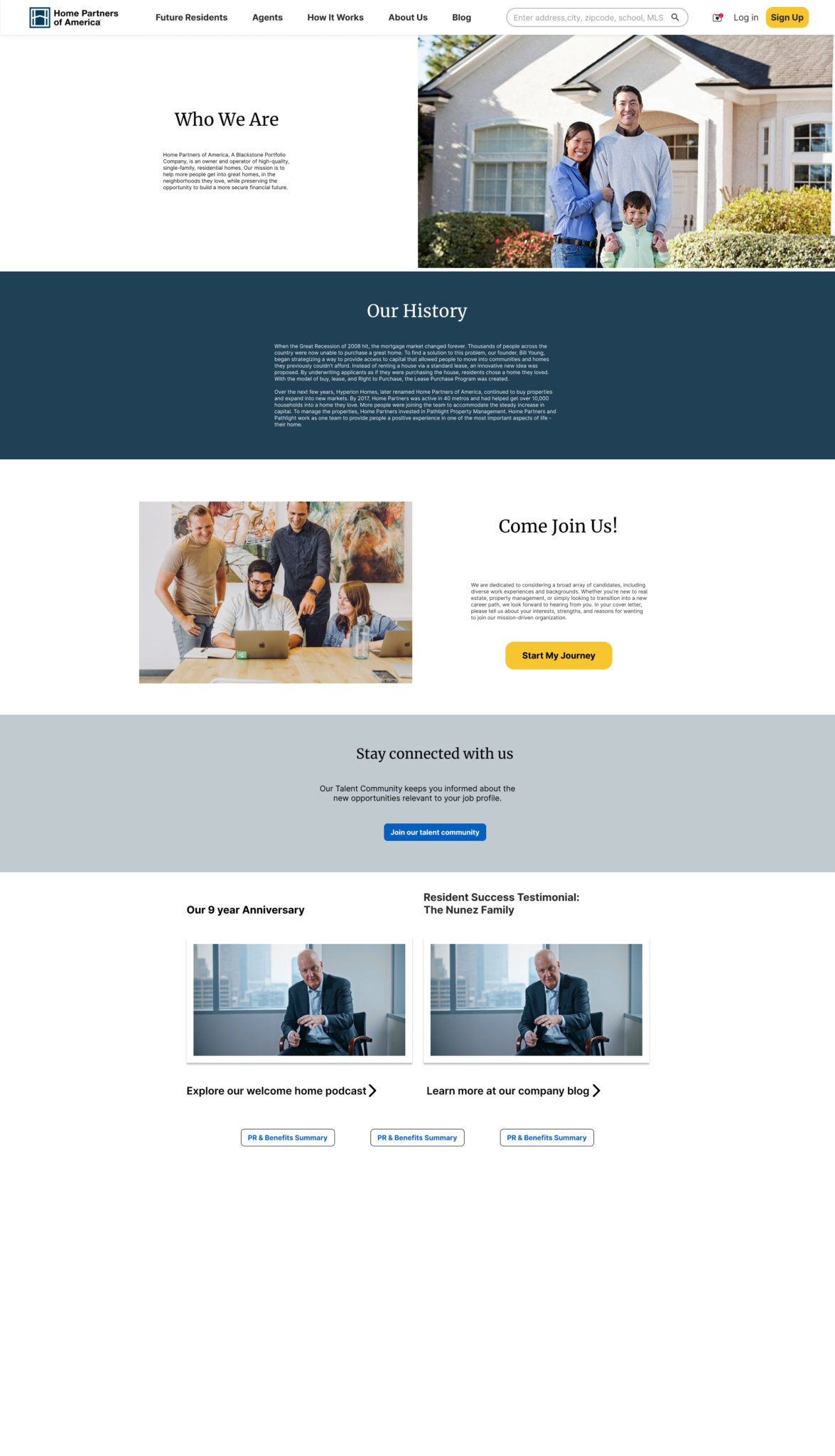
Home Partners of america careers page
UI Design

LOW FIDELITY WIREFRAMES

MID FIDELITY WIREFRAMES
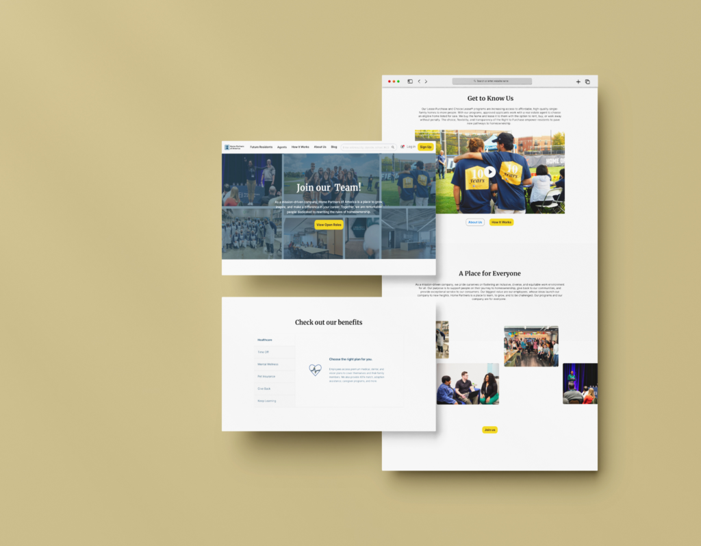
The values are shown through icons in order to attract the users attention and to have them read into what makes the company a great place to work at.
Using images and different assets provided to me by the marketing team, I was able to provide more visual perspective on the culture of the company.
I transitioned away from hiding the benefits behind a link and also presented those through imagery. Icons were also iterated on to become cleaner and more consistent after this stage of design.


