Pekin insurance paperless blling app
UX & UI Design
PROJECT PRIORITIES
Interviewed active residents and compiled data about their pain points and needed improvements
Decrease company spending by creating an intuitive mobile platform to replace paper billing
Reduce customer service costs and agent workload
Create accessible designs for new clients and current clients transitioning to new paperless platform
USER NEEDS
Many users felt intimidated when it came to interacting with their insurance, especially the younger user groups.
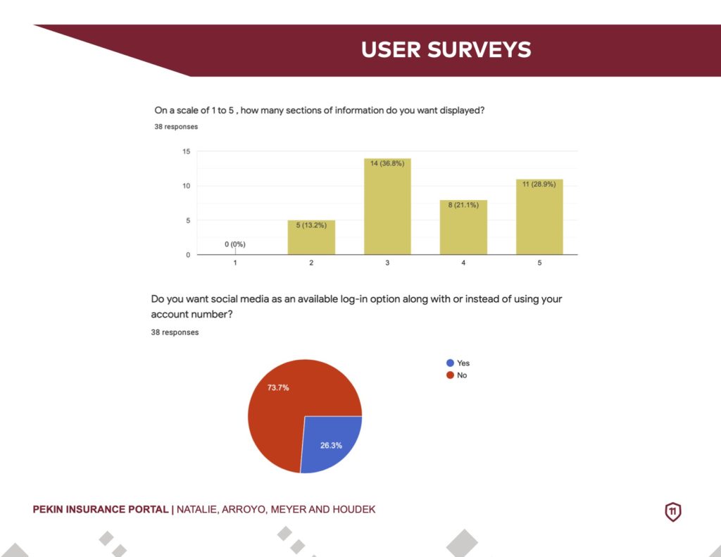
During research, we came to the conclusion that users wanted every detail of their insurance package presented to them. Often times, they felt like there wasn’t enough information detailed to them, making them feel hesitant when the time came to pay a bill.
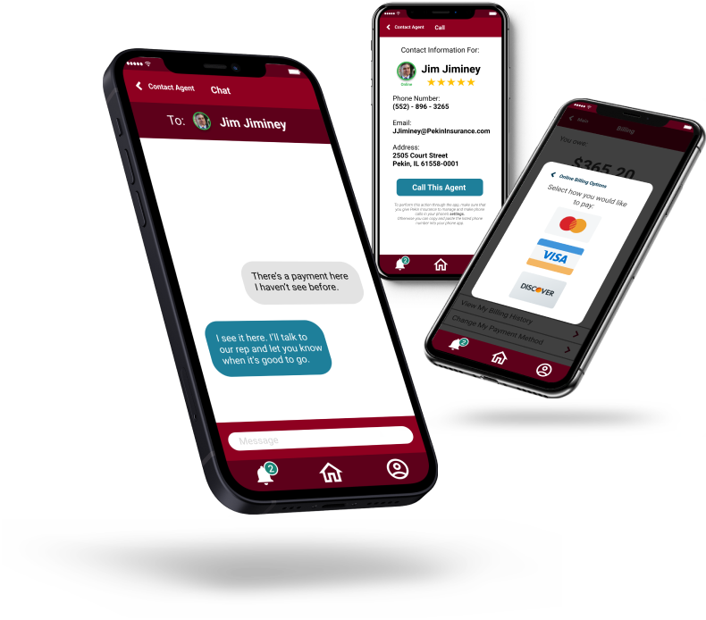
Many users wanted to be able to reach a representative at all times. Since many people work 9-5, they would have to wait until their days off if they had any inquiries. Users want to be able to reach a support team at all times especially if it is urgent.
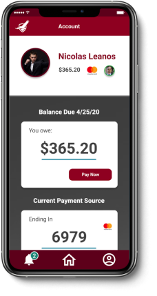
Find a simplified way to present personal information and insurance statements to residents
MAIN FEEDBACK
Residents wanted more consistent communication and updates about their work orders.
FINAL DESIGNS
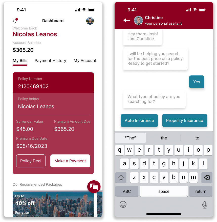
Simplifying the layout of the pages within the app and having a question mark (?) or hints feature would make it easier for the user to navigate the app and figure out where to go or what certain sections are for.
The lack of some important questions in the FAQ section.
Including labels, such as “Agent: Jim Jiminey” or “Pekin Insurance: Messages” would clarify who these notifications are from.
• Navigation of the app was trial and error since it took guessing sometimes to figure out what to do
